 |
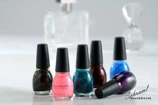
| Simple yet states message |
 |
| Good balance, nice reflection. |
I love the shadows proving depth and texture with the bottles in back.
Similar look and feel just a tighter frame.
Ah, The close up, yet great depth of field and texture.
Well there are a few nail polish shots...Great for POP, Display and advertising.


No comments:
Post a Comment